
Schedule a demo of the HUbSpot CMS
Website integration and use
Previous flight
← Seebives website
Konnexxia Brand Image
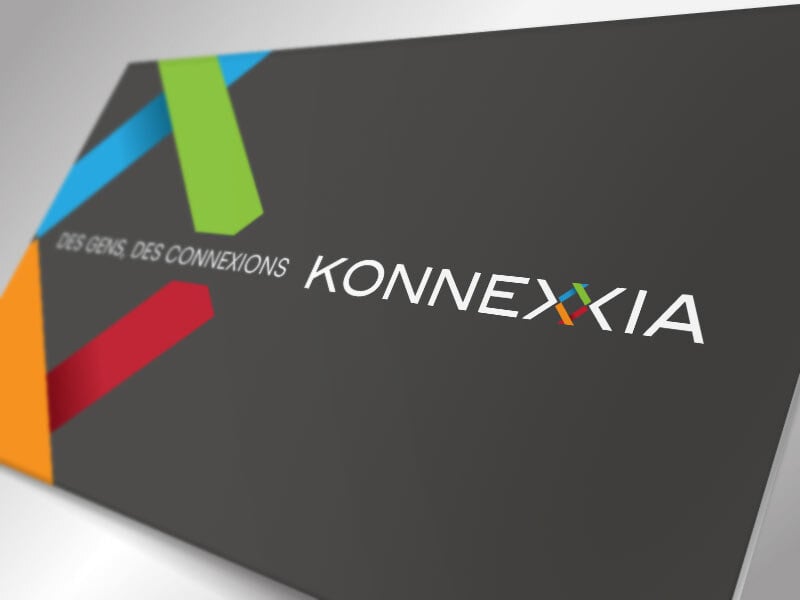
Konnexxia Brand Image
The company commissioned us to:
Apr 26, 2014 12:00:00 AM
New identity for the continuing education of Polytechnique Montréal

New identity for the continuing education of Polytechnique Montréal
POLYTECHNIC CONTINUING EDUCATION INNOVATES… In order to better serve its clientele, Polytechnique’s …
Oct 3, 2012 12:00:00 AM
Graphic design of an e-commerce website for the general public
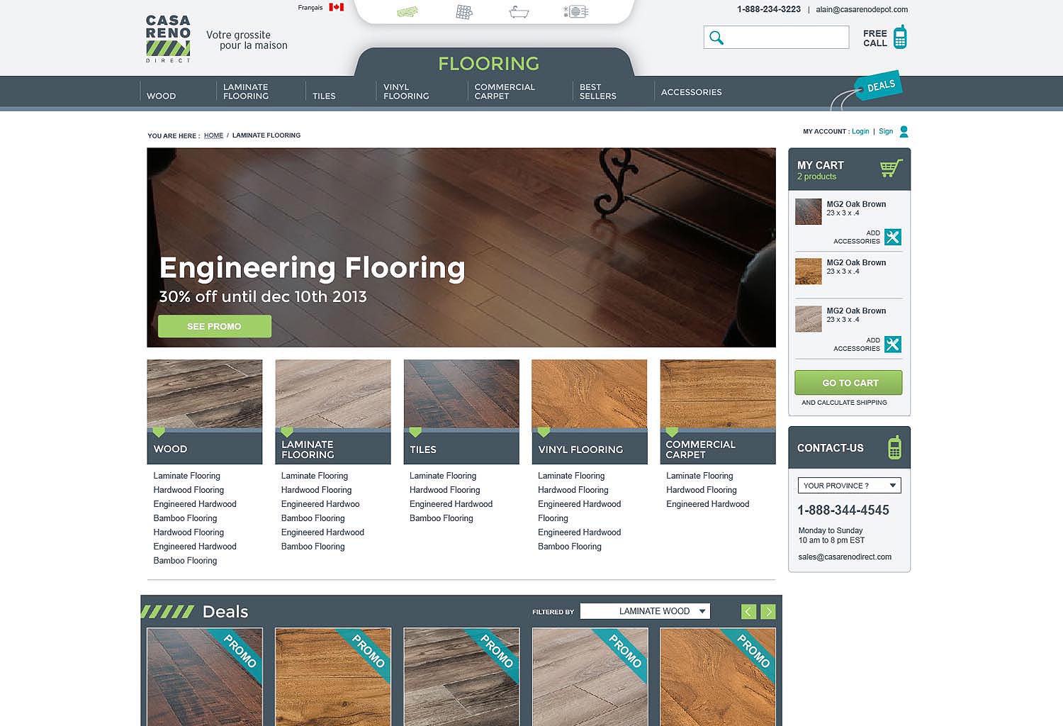
Graphic design of an e-commerce website for the general public
Background Casa Reno Direct is a new company. It has commissioned Avion Rouge to design :
Mar 16, 2016 12:00:00 AM