Designing a Scalable Dashboard: UX/UI Challenges and Solutions for AskAïa
by Avion Rouge Communications on Feb 17, 2026 5:35:39 PM
Identified UX/UI Challenges
User-related challenges
- Designing an interface usable by two very different client types: employees and HR departments.
- Making a large volume of complex information readable (statuses, deadlines, documents, risks).
- Enabling users to take action easily without getting lost in the navigation.
Visual design challenges
- Standardizing the experience across diverse modules.
- Creating a clear, modern, and reassuring visual identity for a sensitive domain like immigration.
- Structuring information to avoid visual overload.
Navigation challenges
- Defining a simple structure despite the presence of many tools.
- Delivering a smooth experience even when users need to perform multiple successive actions.
- Avoiding page reloads or back-and-forth navigation that disrupts workflow.
Technical challenges
- Designing an interface that is easy to develop, modular, and scalable.
- Integrating Tailwind to maintain visual consistency while accelerating development.
- Anticipating a system that allows future modules to be added without redesigning the entire platform.
Design Solutions Implemented
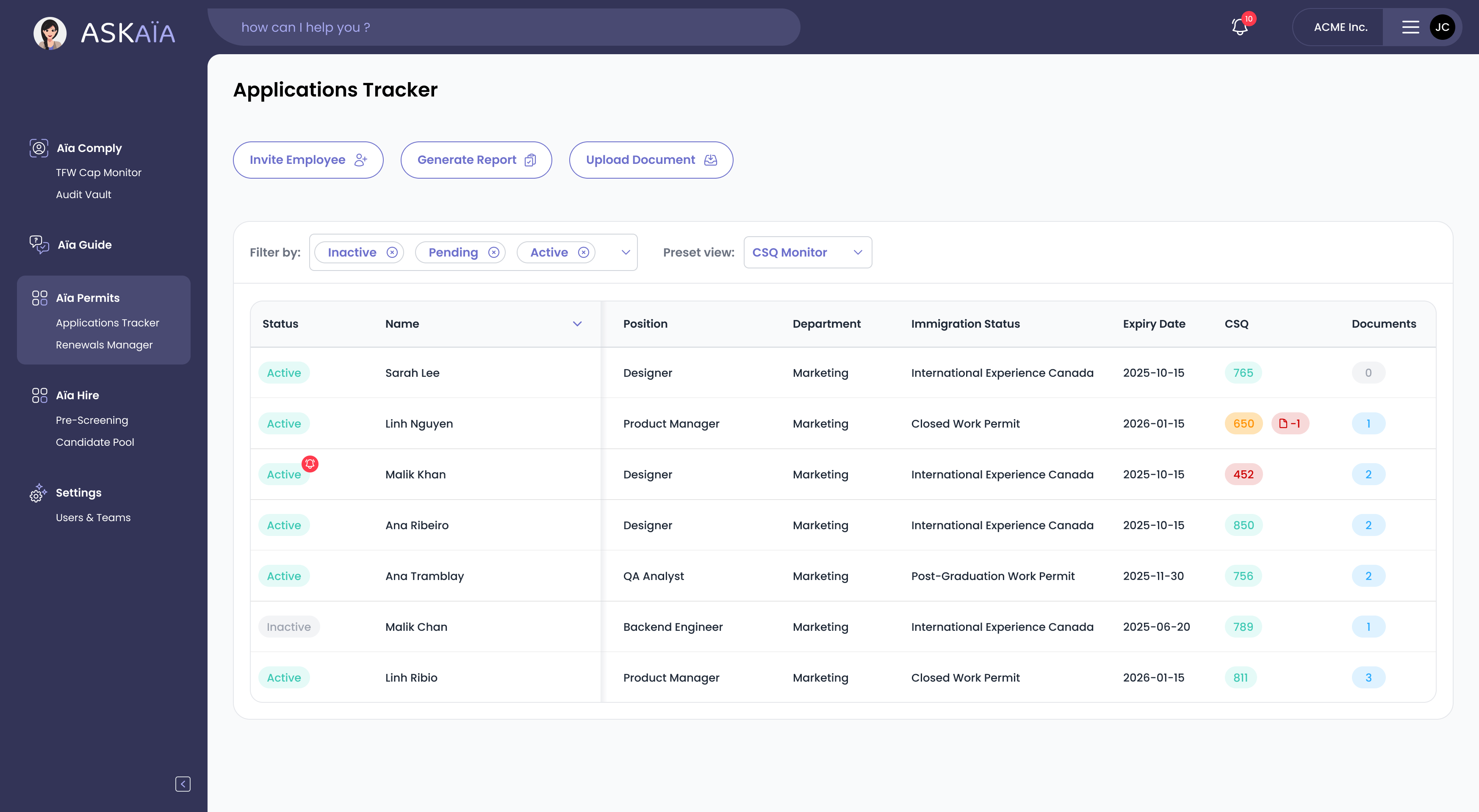
1. A Modular Sidebar Architecture
- A left-side navigation column organized into clear sections.
- Each module is independent but visually consistent.
- The structure supports new tools without impacting existing ones.
2. A Clear and Hierarchical Layout
- Critical information is highlighted using colors, badges, and priority indicators.
- Tables, filters, and predefined views allow quick understanding.
- The design avoids clutter through a clean grid and generous white space.
3. Side Panels (“Sliders”) for Interactions
- Key actions open in a right-side panel.
- Users never leave their context, ensuring a smoother and faster experience.
- Sliders make it easy to integrate new interactions in the future.
4. A Subtle, Cohesive, and Professional Visual Identity
- Soft color palette, readable typography, simplified icons.
- A reassuring visual atmosphere for an administrative process that can be stressful.
- A long-term design approach that remains relevant as content evolves.
5. A Tailwind-Based Design System
- CReusable components and standardized classes.
- Streamlines developer workflows and ensures perfect consistency.
- Enables rapid interface expansion.
A Dashboard Built to Evolve
Thanks to this approach, the dashboard can:
- integrate new modules into the left navigation;
- support new interactions via sliders;
- evolve tables, filters, and views without changing the core architecture;
- adapt its visual style easily through the Tailwind design system;
- be maintained long-term without losing consistency.
The interface is not static—it was designed as a platform in continuous expansion.